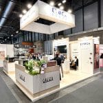
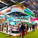
Good exhibition stand branding does far more than make a stand look attractive. It turns your visual identity, from colours and logo to materials, light and layout, into a physical space that visitors recognise from the aisle, understand in seconds and remember after the show. Done well, it attracts attention, encourages interaction and strengthens brand recognition long after the hall has closed.
At a trade fair, dozens or hundreds of companies compete for the attention of distracted visitors. Your stand has to be more than a display area: it should be an immersive experience consistent with your identity, inviting people to stop, learn and connect with what you stand for. A coherent, visually strong design can be the difference between a stand that goes unnoticed and one that becomes a talking point.
At Factoría Creativa we have been designing and building custom stands for over 20 years. Here are the visual branding strategies we use to turn brand guidelines into architecture.
Why exhibition stand branding matters
Visual branding shapes the overall perception of your brand because it is the first thing visitors see as they approach. Every visual element should reflect the brand’s values and personality. Colours, typography, logos and the layout of the space must all be aligned to create a coherent, attractive experience that invites visitors to engage more deeply.
Imagine a company that chooses a minimalist stand dominated by white with metallic details. The stand stands out for its elegant aesthetic, but it also communicates the company’s values: simplicity, elegance and advanced technology. Surrounded by stands crowded with visual information, it becomes a calm and attractive space in the middle of the noise. Branding is not about making something look good; it is about telling a visual story that communicates the brand’s message and gives visitors an experience they will not forget.
Design for three distances
Visitors read a stand in stages, and your branding should be designed for each one:
- From across the hall (20–30 m): height, silhouette and colour. A raised logo, a suspended element or a distinctive shape tells people who you are before they can read anything.
- From the aisle (3–10 m): one clear message and the hero product. Visitors decide in seconds whether to come closer.
- On the stand (under 3 m): detail, texture, product information and conversation.
At Vitafoods Europe 2025, our stand for Lubrizol Life Science worked exactly like this: a backlit suspended cylinder carried the logo to every part of the hall, an open blue arch framed the entrance from the aisle, and screens and multilingual material explained the science up close.
Key exhibition stand branding strategies
Use colour to communicate the brand
Colour is one of the most powerful elements in exhibition stand design. It has an immediate psychological effect: it can evoke emotions, influence decisions and create associations with certain values. Blue is often linked with trust and professionalism, green with sustainability or health, and warm tones such as red and orange with energy, passion or creativity.
Choose a palette that is attractive and aligned with the brand’s personality. A renewable energy company, for example, might use greens and blues to express its commitment to the environment and sustainability, which will appeal to visitors interested in those issues and make the stand feel fresh and modern. Use colour with restraint, though. The aim is not to fill the stand with bright colours, but to use them strategically to guide attention towards the logo, key products or interactive areas. The balance is a stand that is visually striking without being overloaded.
One practical point: corporate colours often look different on fabric, lacquer, vinyl and screens, and under hall lighting. Ask your stand builder for material samples and test prints before production, so your brand colour looks right on every surface.

Logo and typography: the core of identity
The logo is your brand’s most powerful graphic representation and must be prominent in the stand design. It gives visual identity and acts as a symbol visitors recognise instantly. At trade fairs its visibility is essential so people associate the space with the brand, and it should be one of the first things they notice.
Typography matters too. The right typeface improves legibility and conveys the brand’s character: a modern, elegant font may suit a technology brand, while a more handcrafted typeface may suit a company selling organic products. Make sure both logo and typography are large and visible enough without becoming overwhelming. Keep text on walls to a minimum; visitors do not read paragraphs while walking past. Use the same typefaces across stand graphics, screens, brochures and staff clothing so everything reads as one identity.
Lighting and layout: creating the right atmosphere
Lighting does more than make the stand visible; it creates atmosphere. The right lighting highlights the most important elements, such as the logo or featured products, and makes the stand inviting to explore. It also affects how colours are perceived, making some tones look more vibrant or warmer.
You can combine directional spotlights, soft light for a relaxed atmosphere and dynamic LED to highlight specific zones. At a fashion fair, for example, soft light around the products and brighter light over interactive areas keeps the stand both attractive and practical. Backlit fabric graphics are one of the most effective tools for brand walls: they glow evenly, read clearly from a distance and pack flat for transport.
Layout is also part of visual branding. A well-designed stand allows smooth circulation, guiding visitors intuitively and without obstacles. An open, accessible design invites people to step in and explore, while clearly defined zones create different experiences for each visitor. An organised, open layout is more attractive and makes interaction between visitors and staff easier. For the full list of elements to plan, see our exhibition stand design tips.
Turn brand values into materials
Materials are branding too. Natural wood, textiles and planting say something very different from gloss lacquer, glass and metal. When Hausmann Aromatic, a supplier of botanical ingredients and essential oils, exhibited at Vitafoods 2025, we built its stand of almost 200 m² around a tree-like central structure, with FSC-certified wood, suspended greenery and natural fabrics. The brand’s values of natural origin and sensory quality were visible before anyone read a word.
Immersive experiences: beyond static design
A successful stand today goes beyond a static space. Many brands invest in touchscreens, augmented reality or gamification to let visitors interact more deeply with the brand. These experiences increase engagement and leave a more memorable impression. At a technology fair, for example, a brand might use augmented reality so visitors can try its products in a virtual environment, attracting more people and creating a more personal, enjoyable connection. Our guide to AI at trade shows covers interactive options in more detail.
Sensory elements such as sound, touch or even scent make the stand more immersive still. They reinforce the brand message and deepen the connection with the audience, as long as they fit the product and do not disturb neighbouring stands.

Keep your branding consistent from show to show
If you exhibit at several fairs a year, in Spain or across Europe, consistency builds recognition. Visitors who saw you at one show should recognise you instantly at the next, even if the stand size changes. A practical approach is to design a set of recognisable brand elements (a signature structure, a counter, a colour and lighting scheme, a graphic system) that can be adapted to different plot sizes and reused. We can store these elements in our Barcelona workshop between shows and adapt them for each venue. Learn more about our international stands.
Common branding mistakes on exhibition stands
- Too many messages: five slogans compete; one clear message wins.
- Logo only at eye level: it disappears behind people as soon as the stand gets busy.
- Inconsistent colours: different suppliers printing the same colour in different ways.
- Graphics on every surface: no breathing space means nothing stands out.
- Screens with generic content: a video wall showing a corporate film nobody watches from the aisle.
Frequently asked questions about exhibition stand branding
How can I make sure my stand reflects my brand identity?
Use the colours, logos and typography that already form part of your visual identity, and make sure the layout and materials reflect the brand’s values. Keep a consistent aesthetic across every visual element, from structure to brochures and staff clothing.
How important is lighting in stand branding?
Very. Lighting highlights key elements such as the logo, creates an attractive atmosphere and affects how your brand colours are perceived. Good lighting improves the overall perception of the stand and draws visitors in.
What role does colour play in visual branding on a stand?
Colour evokes emotions and is associated with certain values. Choose colours that reflect the brand’s personality and appeal to your target audience, and use them strategically to guide attention rather than covering every surface.
How can I make my stand stand out from the rest?
Combine innovative, creative visual elements with an immersive experience. Design for distance with height and a clear logo, use colour, lighting and layout well, and consider interactive technology or surprising features that attract attention.
Should I use screens or interactive displays on my stand?
Interactive screens can be a great way to engage visitors, letting them interact with the brand in an informative and enjoyable way. Integrate them into the architecture and create content specifically for the stand, rather than reusing a generic corporate video.
How can I measure the success of my stand design?
Look at the level of interaction it generated: did people stop to explore, exchange details or show interest in your products? Track leads, meetings and dwell time, and use surveys or direct feedback to evaluate the design’s impact.
Bring your brand to life at your next fair
Visual branding on an exhibition stand is far more than an aesthetic choice. It is a powerful tool for creating emotional connections, attracting visitors and strengthening your presence at trade events. Every detail counts, from colours and logo to lighting and layout. If you are looking for a stand that showcases your visual identity and captures your target audience’s attention, get in touch with Factoría Creativa or call +34 933 17 17 71. We will help you design a custom stand that makes your brand unmistakable.